Your brand is the face of your company. It’s what people remember, connect with, and trust. But small missteps can dilute your brand’s impact. The good news is that the mistakes we see brands make every day are simple to fix. Below are Team Abovo’s favorite quick tips to strengthen your brand starting today.
1. Clean Up Your URL
Let’s start with a common one that is easy to address. Including “https://” or “www.” in front of your website’s URL is old school, and honestly, you just don’t need it anymore. It takes up space, it’s clunky, and it doesn’t add anything.
Do this instead: Simply use your website’s clean URL. For example, instead of “https://www.TeamAbovo.com” or “www.TeamAbovo.com,” just use “TeamAbovo.com.” It’s modern, cleaner and instantly more professional.

2. Make URLs Easy to Read with Title Caps
While we’re talking URLs, let’s make them easier to read and more memorable. A string of lowercase letters all mashed together is hard to follow at a glance. A simple fix is to use title caps to make the URL stand out more. It’s small, but trust us, it makes a big difference in readability and brand recall.

3. Your Logo Doesn't Need to Be Bigger (or Even There)
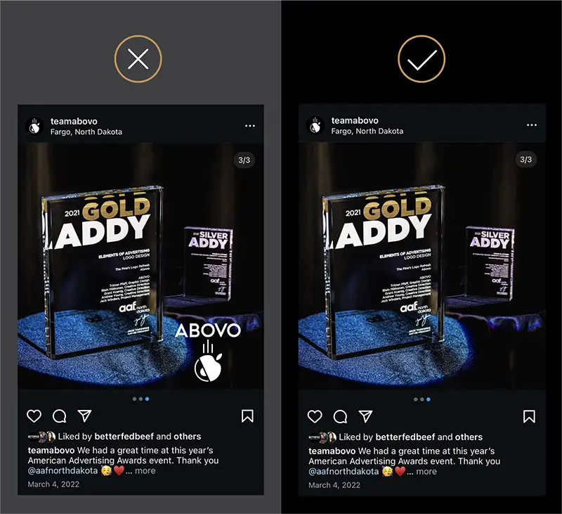
Ah, the “make my logo bigger” syndrome. Listen, we get it (and we’ve heard it over and over), you want your logo front and center. But your logo doesn’t need to be bigger, and sometimes it doesn’t even need to be there at all. Take social media posts, for example. Your company’s profile already displays your name and, likely, logo. Repeating it on the graphic just wastes valuable space.
ABOVO TIP: Always ask yourself, “Does my logo need to be on this at all?” If it doesn’t, remove it and let the content speak for itself. Or, if you have your logo appearing once, keep it that. You don’t need it on every page.
4. Use Coco Chanel's Advice for Design Work
One of our founder’s (Andrew) favorite quotes by Coco Chanel:

Apply this to your design work. Everything on your social media graphics, brochures or booklets should have a purpose. If it doesn’t, it’s clutter. And clutter dilutes your message.
ACTIONABLE TIP: Review your current designs and ask yourself, “What can I remove to make this cleaner and more focused?” You’ll be surprised how much more professional your branding will look when it’s not cluttered with unnecessary elements.
5. Create a Simple Brand Style Guide
This one is non-negotiable. If you don’t already have a brand style guide, even a simple one, you’re missing out on consistency and professionalism. At a minimum, your guide should include your logos, color codes, and typefaces. And most importantly, stick to it. When your branding is consistent, it builds trust and recognition.

ACTIONABLE TIP: If you don’t have a brand style guide, take a few minutes today to draft a basic one. Even if it’s just a page with your logo, brand colors, and fonts, it will help you stay consistent across all your marketing efforts. And if you want to dive deeper, we’ve put together a blog highlighting the 19 things your brand style guide should have. But if that’s too much right now, please, please start with the three essential basics.
Craving some personalized advice for branding and strategy?
Schedule regular or one-off coaching or consultation calls with us here.