Logo Design: More Than Just a Pretty Face

A great logo works, not just looks good. It’s the face of your company and often the first impression people have. But a brand is more than a logo. It’s your company’s personality, voice, and presence, built up over time through consistency and trust. A well-designed logo does more than exist. It represents what you stand for.

Every element of a logo has a purpose, and understanding those components can help ensure your logo and brand identity are as strong as possible.

Breaking Down the Pieces

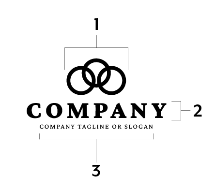
Every logo consists of different elements that work together to create a complete visual identity. Some brands use all of them, while others rely on just one or two. Let’s break it down:

1. Logomark

This is the symbol or icon of a logo: the visual piece that can stand on its own. Think about Apple’s apple, Nike’s swoosh, or Starbucks’ mermaid. A strong logomark can be recognizable even without the company name.

2. Logotype

This is the typography-based part of a logo: the company name written in a distinctive font or style. Coca-Cola’s script or Google’s colorful sans-serif letters are prime examples of a logotype-driven identity.

3. Tagline

Not all companies need a tagline, but when used well, it can reinforce a brand’s message. Nike’s “Just Do It” is the perfect example of a tagline becoming an inseparable part of a brand identity.

A well-designed brand and logo balance these elements in a way that feels intentional, memorable, and, most importantly, effective.

Logo Lingo: Jargon & Guidelines

  • A logomark is sometimes called an emblem.
  • A logotype is sometimes called a wordmark.
  • A tagline is sometimes called a slogan.
  • Not all brands use, have or need a tagline.
  • All brands have, need either a logomark, logotype or a logomark and logotype.

Team Abovo™ Logo & Brand Design Process

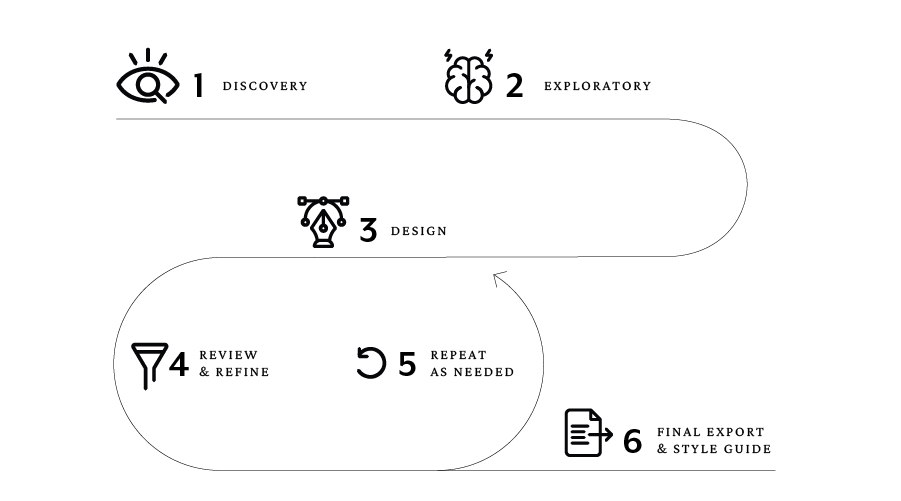
Logo design is just the start. We craft entire brand identities. A logo should be treated as more than a graphic. It should be a clear representation of your business. Our process ensures that every logo we create is strategic, timeless, and built to work in every application. Here’s how we do it:

1. Discovery

Before we sketch a single idea, we take time to understand your brand. What do you stand for? Who is your audience? What makes you different? This phase is all about gathering insights and setting the creative direction.

2. Exploratory

We research and brainstorm. We explore trends, competitors, and industries to ensure your logo stands out. This step helps us establish a unique position for your brand before any design work begins.

3. Design

This is where the real work begins. Our team creates multiple logo concepts based on everything we’ve learned in the previous steps. At this stage, we design in one color. The strongest logos hold their own in a single color, since logos often appear in one-color applications like engraving, embroidery, or black-and-white printing. Color can also be a distraction. It’s like touring a house and getting stuck on the wall color, even though it’s an easy change. By focusing on form, typography, and balance first, we ensure the foundation is solid before adding anything else.

4. Review & Refine

Once the logomark and logotype are confirmed, we introduce color, ensuring it aligns with the brand’s personality and purpose. This phase focuses on refining details, like spacing, weight, and overall balance, to create a logo that is both visually strong and strategically sound. The review process is intentional and efficient, and because so much thought is put into the exploratory phase, it’s rare for us to go beyond two to three rounds of refinement. The result is a logo that works in every application and holds up for years to come.

5. Repeat 3 & 4 as Needed

Some logos are love at first sight; others need a few tweaks. Thanks to the intentional time we invest in the exploratory phase, it’s rare for us to go through more than 2–3 rounds of design and review. By the time we reach this stage, we’re refining, not reinventing. The final logo comes out polished and purposeful.

6. Final Export & Style Guide

Once the final logo is approved, we deliver it in multiple formats: print, web, social, embroidery, signage, and more. But a strong brand is about more than a great logo. It’s about consistency. That’s why we provide a comprehensive brand style guide that outlines how to use the logo properly, from color specifications to spacing, ensuring a cohesive look across all platforms.

This guide is more than a reference. It’s a tool. For clients who manage some design work internally or collaborate with multiple designers and vendors, having clear brand rules in place ensures consistency, no matter who is handling the creative. Before any project starts, handing over the style guide keeps everything aligned and the brand looking like itself.For a deeper look at what makes a strong style guide, check out our breakdown of the 19 key components every brand guide should include.

Explore the variety of brands and logos we've created:

Don’t Stop Here

More To Explore